Showing posts with label Definitive Coins. Show all posts

Definitive Coins - Ten Rupees - New Rupee Symbol

Link to All Artices is here.
Link to All Definitives is here.


This post is a three part series on the Rs 10 definitive coins.

Part 1: Unity in Diversity
Part 2: Connectivity and IT
Part 3: New Rupee Symbol


The third design quickly followed with the adoption of the Rupee Symbol in 2011. The overall theme was kept similar to the older “Connectivity and IT” Design with some small changes.

The Obverse shows the Ashoka Lion Capitol with “Bharat” in Hindi on left side and India in English on Right side. The Date is below. This is slightly different than the older design where the Bharat/India was in the top portion.

The Reverse shows 10 radiating lines instead of the 15 earlier. There is Rupee Symbol and hence the words Rupees in English and in Hindi are no longer present. The Value 10 is below compared to in center in the previous design.


Definitive Coins - Ten Rupees - Connectivity and IT

Link to All Artices is here.
Link to All Definitives is here.


This post is a three part series on the Rs 10 definitive coins.

Part 1: Unity in Diversity
Part 2: Connectivity and IT
Part 3: New Rupee Symbol


In a short span a second design was adopted for the Rs 10 coin, this was called “Connectivity and IT”.


Mints:
Year Emblem Description Metal Mints


2008 Ashoka Emblem 15 Rays around value Bi-metallic N
2009 Ashoka Emblem 15 Rays around value Bi-metallic N
2010 Ashoka Emblem 15 Rays around value Bi-metallic M
2010 Ashoka Emblem 15 Rays around value Bi-metallic N


The mint mark on the Noida coin is hard to read and is almost on the rim. Quite a few times blurred.
For more details on the design, read the article “A tale of3 Designs


Definitive Coins - Ten Rupees - Unity In Diversity


Link to All Artices is here.
Link to All Definitives is here.


This post is a three part series on the Rs 10 definitive coins.

Part 1: Unity in Diversity
Part 2: Connectivity and IT
Part 3: New Rupee Symbol

As part of Unity In Diversity a new set of coins was released in 2004 / 2005. A Single Coin UNC Set was also planned to be released, but was not. This was the first time that a Rs 10 denomination coin was introduced in circulation as definitive. The first Rs 10 coins for general circulation were commemorative coins in silver in 1969 – Gandhi, 1970 – Food for All and 1972 – Independence Jubilee.


Mints
2005

 N
2006  N
2007  N

Although the coins were struck from 2004, they were actually put into circulation in the year 2009. Taking advantage of this, quite a few dealers sold these are rare at handsome price.
This is only design in the republic coinage that has the value written in words in both English; ie “Ten in English” and “Dus in Hindi” on the Reverse. The only other design where value is spelt out in Hindi are the 1964 designs after dropping of the word “Naya”.
For more details on the design and controversy; Read the article here and here.


Definitive Coins - Five Rupees - Part 2

This is part of the Definitive post on Rs 5 coins. The First part talked about Cupro Nickel coins. This post talks about other coins.

5 Rupee – Stainless Steel – Unity in Diversity
Amongst the most controversial coins of the times, the Unity in Diversity theme was adopted for the Definitive coins. The Rs 5 was struck with only one date of 2007 from Kolkata mint, the most common denomination in this series is the Rs 2 coin.


This is only design in the republic coinage that has the value written in words in both English; i.e. “Five in English” and “Panch in Hindi” on the Reverse. The only other design where value is spelt out in Hindi are the 1964 designs after dropping of the word “Naya”.
For more details on the design and controversy; Read the article here and here.
______________________________________________________________________________

5 Rupee – Stainless Steel – IT & Connectivity
The Design gave way to a new IT & Connectivity design. The metal was still steel, with edges still security edges. There were stories that these coin were used to make blades in neighbouring country and hence the metal quickly gave way to Nickel Brass. The coins were minted from 2007 to 2008.


______________________________________________________________________________

5 Rupee – Nickel Brass
Not withstanding the new designs for definitive’s, In 2009 the old Cupro-Nickel design was again adopted. The only change was metal of the Rs 5 coins was was now Nickel Brass. There coins were struck only for 2 years before the design was change and the Rupee symbol adopted. The Usage of 2 Types of Lions from the older Cupro-Nickel continued. The Mumbai Mint used the Thin Lion and the other mints used the Big Lion. A classic case of one step forward and 2 back.


A strange story of the Hyderabad Mint of 2009.
  • The first strikes looks with a different Reverse. Although the Lion is of Kolkata Mint type, the lettering of “India” is very thick. Not sure if this was as a result of more pressure during hubbing.
  • It then looks like it got the right pair of dies from Kolkata Mint.
  • Further it looks the Obverse die used got worn out and Kolkata mint also ran out of stock. Hence Mumbai Mint provided the dies for the remaining strikes.


A new Obverse die was introduced in 2010. Although the key elements of design were same,
  • The size of the complete design was scaled down by about 2-3 mm.
  • Smaller and thicker numeral 5.
  •  The Rupaya in Hindi is quite below from the edge.
  • The font used for Year 2010 is different. Notice the “1”, etc.
 As this design was introduced in 2010, from Mumbai mint we have both the Die Varieties for 2010. All other mints use only the new Obverse.


_________________________________________________________________________________


5 Rupee – New Floral Design
The current design except for adoption of the Rupee symbol, the key design is pretty much the same as the older Cupro-Nickel coins, surprisingly the Mumbai Mint gave up on its small / thin lion and adopted the Lion that were being used by other mints.


As with other coins, we also have plain edges here. So far I have seen a plain edge from Kolkata Mint for the year 2013. However its to early to say, there are bound to be plain edges for other years and mints as well, they are just waiting to be discovered by numismatist.


Plain Edge for New Rupee Symbol
Year
Mint
2013
Kolkata


Definitive Coins - Five Rupees - Part 1

This post is organized as 2 part post. This post talks about the Cupro-Nickel issues. All other issues are in next post.

The Rs 5 denomination was first introduced as a Circulation commemorative in 1984 on the Death of Indira Gandhi and then later on the Birth Centenary of Jawaharlal Nehru. The coins were bigger in size. A definitive was first introduced in 1992, just a couple of years after the Rs 2 was introduced in 1990.
The size of the definitive was always controversial as it was almost the same size of the 50 paise coin. The difference being the thickness.
The coins gave way to steel briefly before moving to Nickel Brass, the composition of the current coins.
The coins by Mumbai Mint have Die Variety for the year 1998 to 2000 where 2 Lion types have been used. Apart from this there are Edge Verities with Milled edges for quite a few years and Plain edge for lesser number of years.

Note: This was in use by all mints from 1992 to 1997.
In 1998, Mumbai Mint created a new die [see below 154.4] with thin lion. In the years 1998 to 2000, the Mumbai Mint coins are available in both Reverse dies. From 2001 onwards, Mumbai Mint only used the Reverse in 154.4 and discontinued in the 151.1


For Mumbai Mint the Milled Edge is available for all Years. 1992, 1993, 1994, 1995, 1996, 1997, 1998 Both Lions, 1999, 2000, 2001, 2002, 2003, 2004

For Kolkata Mint the Milled Edge is available for all years from 1992 to 2004.
For Kolkata Mint the Plain Edge is available for Years 1992 and 2003.

For Hyderabad Mint the Milled Edge is available for all Years. 1992, to 2004.
For Hyderabad Mint Plain Edge is available for Year 1998


For Moscow Mint the reeded edge is available for the year 2000.


The 1992 to 2004, Kolkata Mint Milled Edges.

Image Credits: Sekhar Kausik


Definitive Coins - Two Rupees - Part 2

This post is organized in 2 parts. The first part details about the Cupro-Nickel issues. This post details about the other definitive issues.


Amongst the most controversial coins of the times, the Unity in Diversity theme was adopted for the Definitive coins. The Rs 2 coin was most widely available in circulation. The Rs 5 was struck with only one date of 2007 from Kolkata mint. Although the coins were struck only for a brief period of 3 years, there are quite a few die variations and other mysteries. The best being the Orientation of the Obverse with respect to the Reverse.


 This is one of the most controversial designs. The design was described as “Unity in Diversity”. The modern design was to be read as “Four heads sharing a common body”. It was to represent people from different parts / walks of life coming together and forming the Nation. The design was first introduced on the One Rupee coin in 2004, and later was taken to Rs 2 and Rs 10 as well. The last to be minted was on Rs 5 coin. Hindu groups saw this design as “Cross” and associated it with Christianity. This forced the Government to adopt new time tested floral designs.
For more details on the design and controversy; Read the article here and here.

This coinage has a strange story of Orientation, the coins of 2005 come in both orientation “+” and “X”. This is not just in one denomination, but across Rs 10 and Rs 1 as well.
Apart from this, it is apparent that 2 dies were created, and they have been used interchangeably on the 2005 and 2007 years coins from Kolkata mint.


Amongst the most ill-struck coins. Finding a good specimen is more difficult that an error prone one.

- Most die exhibit a weak strike
- Partial or missing “Jayate” in most coins
- Mild die clash visible on both side of quite a few coins
This is only design in the republic coinage that has the value written in words in both English; i.e. “Two in English” and “Do in Hindi” on the Reverse. The only other design where value is spelt out in Hindi are the 1964 designs after dropping of the word “Naya”.

Die Varieties:
Plenty of Die Varieties:

  1. Big and Small Date from Mumbai Mint
  2. There are 2 distinct Orientation of Obverse & Reverse used for the coins.
  3. The Reverse itself has 2 varieties with Enlarged Cross; rarely used by Kolkata Mint on 2005 & 2007 definitives. The other Obverse has small cross. Even the Numeral 2 on the Obverse has 2 varieties.


The controversial “Unity in Diversity” design soon gave way to other designs. On the coins of 50 paise, Rs 1 and Rs 2, the Mudra design was 
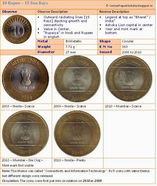
adopted and on Rs 5 and Rs 10 the “Connectivity and IT” design was adopted. For more on these 3 designs, read the article “A Tale of 3 Designs
The design on Rs 2 was Hand Gesture from Bharat Natyam, “Kartarimukha” meaning Arrow Shaft or Scissors.
Even this design survived only for a brief period from 2007 to 2011


The adoption of Rupee symbol meant new designs. The current design except for adoption of the Rupee symbol, the key design is pretty much the same as the older Cupro-Nickel coins, the flowery design. Apart for adoption of the symbol, the size of the coins was reduced to the size of the old Rs 1 coin. The edges have wide serrations on the edge.


The first coins introduced has a Thick Rupee symbol on this, this was minted by all the 4 mints in the first year, i.e. 2001. However a new die was introduced later in the same year, to make the Rupee symbol more thinner and this was used by Mumbai, Kolkata and Hyderabad in the Year 2011. From 2012 onwards all mints used this new die. The same die variety also exist in the Rs 1 denomination.


Plain Edge Die Variety
Year
Mint
2011
Mumbai
2011
Kolkata
2013
Kolkata
2013
Hyderabad